Anim Picker User Documentation
The Anim Picker is mGear’s picker tool for animators: a graphical board of buttons that select and drive a rig’s controls, so you can pose a character without hunting for controllers in the viewport. Version 2.0 is a full rewrite of the original picker with a modern editor, vector (SVG) shapes, interactive widgets, viewport pins, conditional visibility, mirroring and a click-through “heads-up display” mode.
A picker is stored per Maya scene on a PICKER_DATAS node (as clean
JSON), and can also be exported to / imported from a .pkr file to reuse it
across scenes and characters.
Opening the Anim Picker
From the mGear menu (mGear ▸ Anim Picker) you have three entries:
Anim Picker: the floating animation window (the picker you pose with).
Anim Picker (Dockable): the same animation window, dockable into Maya’s UI as a workspace control.
Edit Anim Picker: the editor, where you build and lay out the picker.
You can also open it from Python:
from mgear import anim_picker
anim_picker.load()              # animation mode (floating)
anim_picker.load(dockable=True) # animation mode (dockable)
anim_picker.load(edit=True)     # edit mode
The Animation window
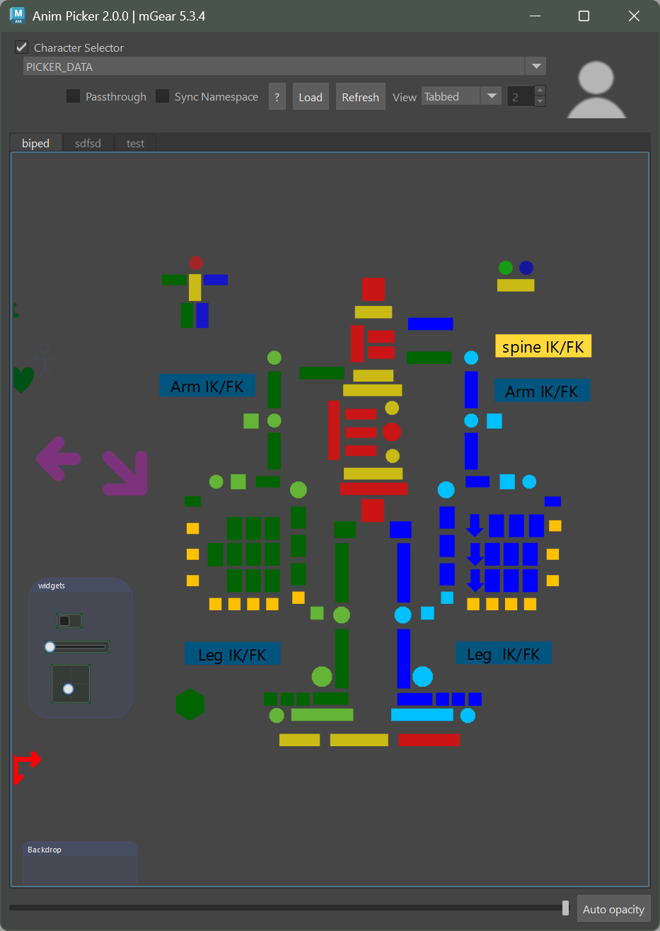
The top bar drives which picker is loaded and how it behaves:
Character Selector: the collapsible header holds the picker-data combo box (which
PICKER_DATASnode to show) and a snapshot picture of the character. Uncheck the group title to collapse it.Passthrough: turns this window into a click-through overlay (see Opacity passthrough).
Sync Namespace: when on, the picker resolves its controls in the namespace of your current selection, so one picker drives any referenced instance of the rig.
Load / Refresh: load a picker from a
.pkrfile, or re-read the data node and re-sync the widgets to the rig.View: Tabbed shows one tab at a time; Tiled shows several tabs side by side (the spinbox sets the column count).
Tabs: a picker can hold several pages (e.g. body, face); click a tab to switch.
Selecting controls: click an item to select its associated control(s). Hold Shift to add to the selection, Ctrl to toggle, and drag on empty canvas to marquee-select. Panning is middle-mouse drag, zooming is the mouse wheel, and F frames the content.
At the bottom, the opacity slider fades the whole window, and Auto opacity makes it fade automatically while the mouse is away and become opaque on mouse-over — handy for keeping the picker on screen without hiding the viewport.
Opacity passthrough
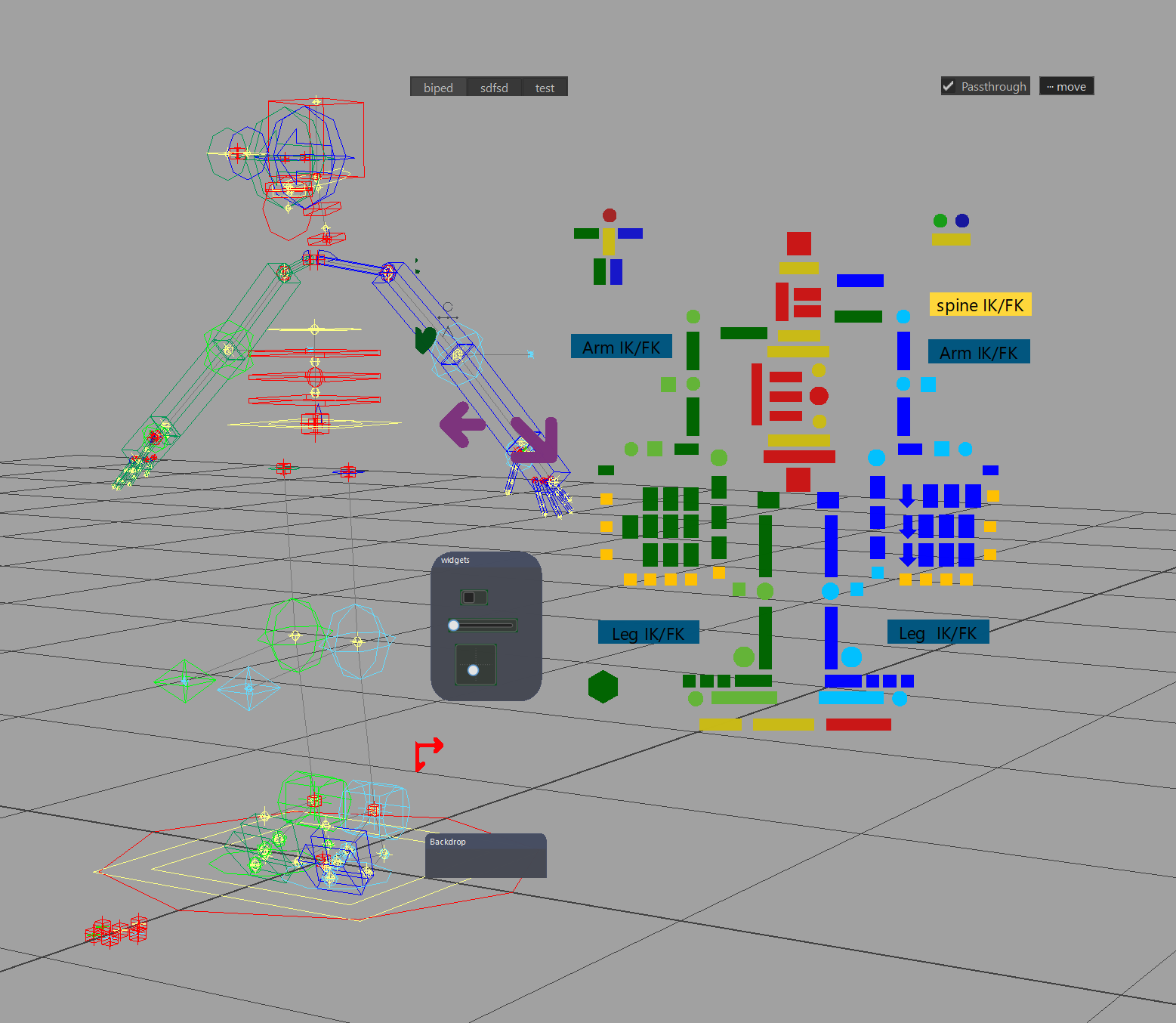
Passthrough turns the floating picker into a HUD you can click straight through. Check the Passthrough box and, while the window is transparent (opacity below 100%) with Auto opacity off, everything except the item buttons and the tabs becomes see-through and click-through — clicking an empty gap selects and manipulates the rig in the viewport behind, without moving the picker aside. Each item is cut on its real shape, so vector buttons follow their outline.
Checking the box on a fully opaque window drops it to a transparent default so it engages in one click; unchecking restores the solid window (your last transparency is remembered).
A small “··· move” grip and a second Passthrough checkbox appear at the top-right (the in-row checkbox is hidden while masked), so you can drag the window and switch passthrough off without leaving the mode.
During a pan or zoom the full window comes back and moves smoothly, then re-masks the moment you stop.
Passthrough is per-window: enabling it on one open picker does not affect the others. It applies to the floating window only.
Edit mode
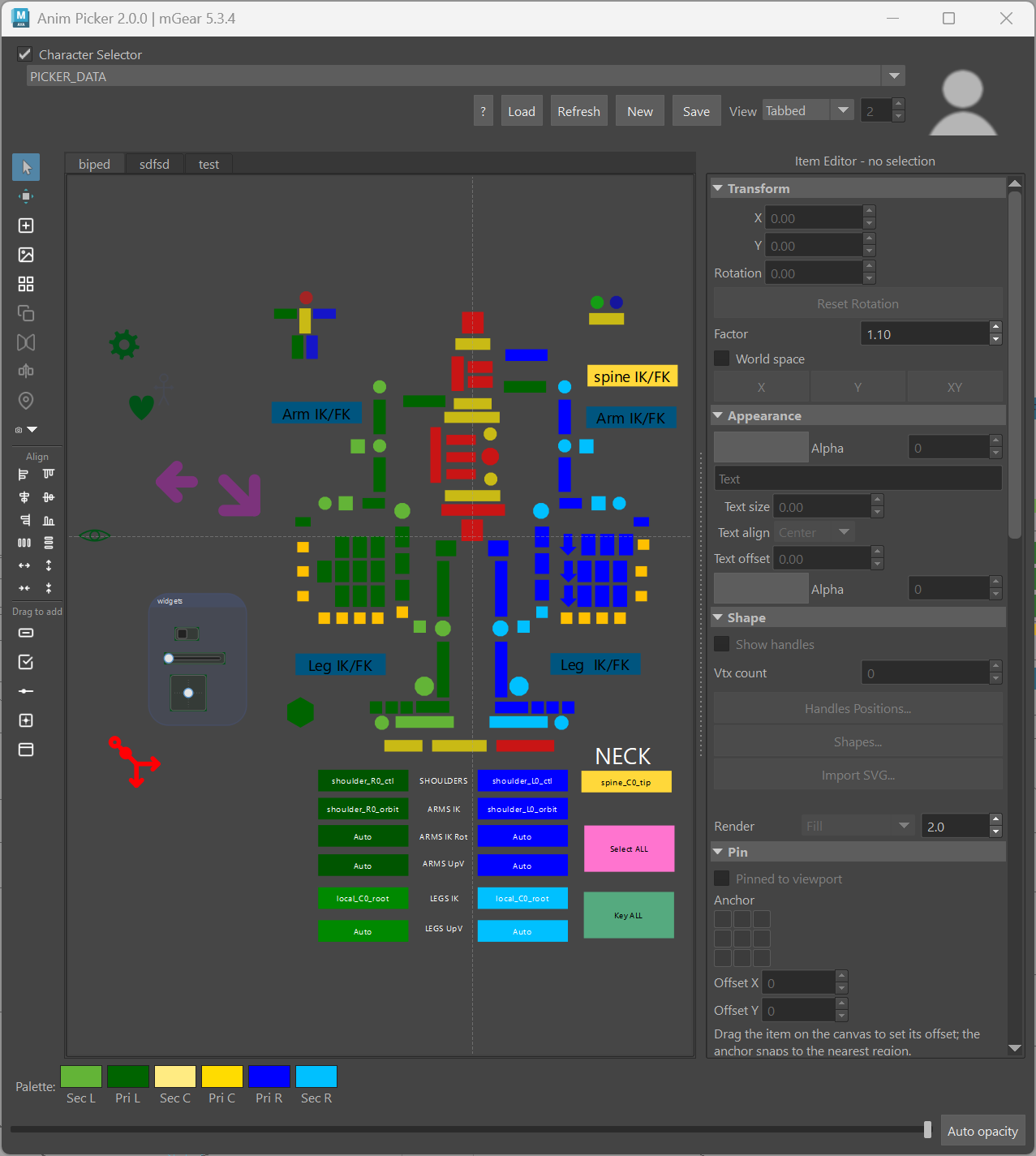
The editor adds a left tool strip, a color palette along the bottom,
and the Item Editor panel on the right. New creates a fresh picker on a
data node; Save writes the current picker to a .pkr file.
Note
Every change in edit mode is recorded to an undo / redo stack (per tab). Use Ctrl+Z / Ctrl+Shift+Z, and the usual Ctrl+C / V / X (copy / paste / cut), Ctrl+D (duplicate), Ctrl+Shift+D (duplicate & mirror), Delete, Ctrl+A (select all), arrow keys to nudge (Shift for a larger step), F to frame and Esc to clear the selection. Shortcuts fire only while the picker has focus, so they never leak into Maya’s global hotkeys.
The tool strip

The top of the strip holds the canvas tools:
Select and Transform: switch between selecting items and showing the move / scale / rotate manipulator to transform them on the canvas.
Add item: drop a new default button on the canvas.
Add background image: add an image layer behind the items.
Shape library: open the shape picker (see Shapes).
Duplicate and Mirror: copy the selection, or mirror it across the symmetry axis (with an optional name search / replace so the copies target the opposite-side controls).
Pin: pin the selected items to a viewport corner as an on-screen HUD (see Pin).
Trace from rig: auto-generate a picker from the rig’s control layout (see Auto-build from the rig).
Auto-build from the rig
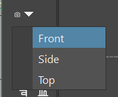
The camera drop-down at the bottom of the tool strip builds a picker straight from the rig. It looks at the scene’s controls from a Front / Side / Top view and traces the convex hull of each control, creating a picker item per control laid out to match the rig’s spatial distribution — a fast way to get the whole control layout in one step, which you then refine (shapes, colors, grouping).
Aligning and distributing
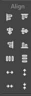
The Align section lines the selected items up (left / right / top / bottom / center, horizontally or vertically), distributes them evenly, and expands / contracts their spacing a step at a time about the selection’s center — quick ways to tidy a row or column of buttons.
Drag to add — widgets & backdrops
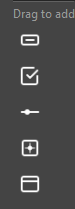
The Drag to add section lets you drag ready-made items onto the canvas: interactive widgets (checkbox, slider, 2D slider), a plain button, and a backdrop. Drop one where you want it, then configure it in the Item Editor.
Building items
Shapes
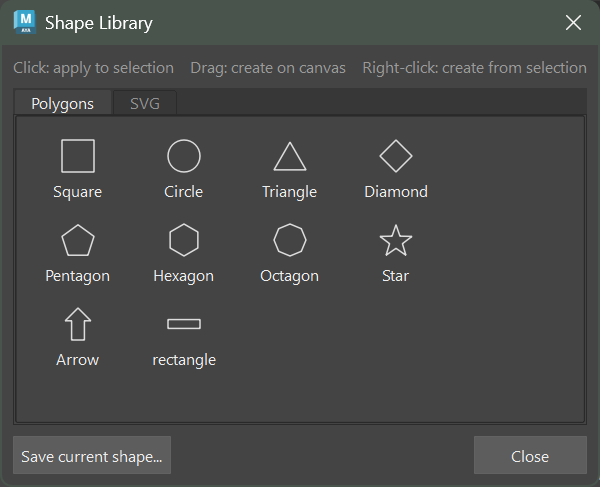
The Shape Library (tool strip, or the Item Editor’s Shapes… button) holds ready shapes across two tabs — Polygons (square, circle, triangle, diamond, pentagon, hexagon, octagon, star, arrow, rectangle …) and SVG (curved / organic icons like gear, heart, eye, hand). There are three ways to use a tile:
Click — apply that shape to the selected item(s).
Drag — create a new item with that shape at the drop point.
Right-click — create from selection: one item per selected Maya control, laid out in a row or column and each linked to (and colored from) its control.
Save current shape… stores the active item’s shape (polygon or vector) into your user library for reuse.
You can also build a shape from Maya curves: draw the outline as NURBS curves, select them, and the picker traces them into an item’s shape.
The Item Editor
Selecting an item in edit mode fills the Item Editor panel on the right. Its sections cover every property of the item; the most-used ones are open by default.
Transform
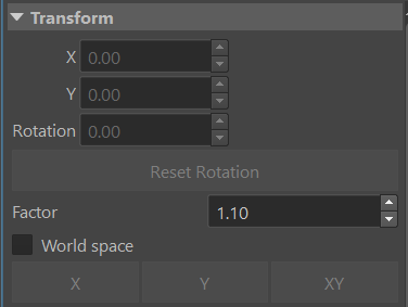
Position (X / Y) and Rotation of the item, a Reset Rotation button, and a Factor with X / Y / XY buttons to scale the selection by that factor (uniformly or on one axis). World space toggles whether the transform is read in scene or local space.
Appearance
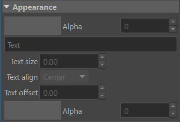
The item’s color and Alpha (transparency), an optional Text label with its size, alignment and offset, and the text’s own color / alpha. Text is stored display-independently so it looks right across monitors, and scales on high-DPI screens.
Shape
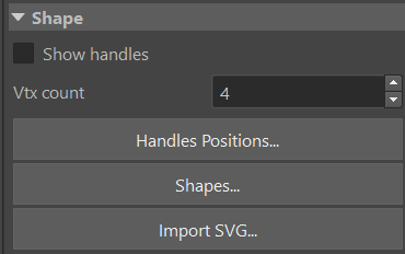
Controls for the item’s outline: Show handles to edit the polygon points
on the canvas, the Vtx count, Handles Positions… for numeric point
entry, Shapes… to open the library, and Import SVG… to load a
vector shape from a .svg file. Vector items expose a Render mode
(Fill or Stroke) and a stroke width. (Vector items have no editable
points, so Show handles is a no-op for them.)
Controls
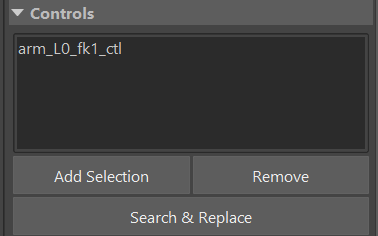
The Maya control(s) this item selects. Add Selection links the currently
selected controls, Remove unlinks the highlighted one, and Search &
Replace rewrites the names in bulk (e.g. _L0_ → _R0_) — the quick way
to retarget mirrored buttons.
Action
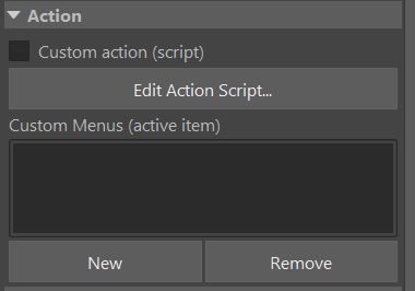
Give the item behaviour beyond selection. Custom action (script) runs a Python script when the item is clicked (Edit Action Script…), and Custom Menus add right-click menu entries with their own scripts.
Widgets
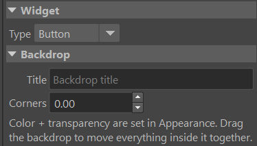
The Type drop-down turns a plain button into an interactive widget that reads and drives a rig attribute directly in the picker:
Checkbox — toggles a boolean attribute (or master-controls the visibility of an item group, see Visibility).
Slider — drags a single attribute between a min and max.
2D slider — drives two attributes (X / Y) at once from one handle.
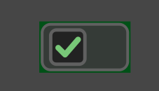
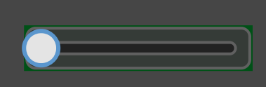
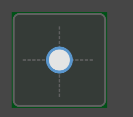
Each widget is bound to its attribute(s) and range in the editor, and stays in sync with the rig on selection / time change.
Backdrop
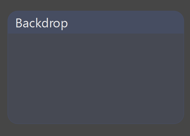
A backdrop is a titled panel drawn behind other items to group them visually. Set its Title and Corners (rounding); its color and transparency come from Appearance. Dragging the backdrop moves everything sitting on top of it together.
Visibility
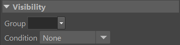
Show or hide the item conditionally:
Group — tag the item into a named group. A checkbox widget set to control that group can then show / hide every item in it at once (with an optional invert), right in the picker and with no rig attribute required.
Condition — show the item only by zoom level or by a channel state (e.g. an IK button visible only when the limb is in IK). Conditions and groups compose: a grouped item with its own condition is shown only when its group is shown and its condition passes.
Edit mode always shows every item, so conditional visibility never blocks authoring.
Pin
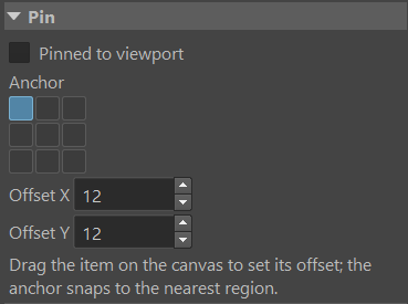
Pinned to viewport locks the item to a fixed spot on the canvas — it keeps its screen position and size through pan and zoom, so it works as an on-screen HUD button (a corner reset, a space switch, a settings button…). Pick the Anchor cell (3×3) it sticks to and an Offset, or just drag the item on the canvas to set the offset (the anchor snaps to the nearest region).
Mirror
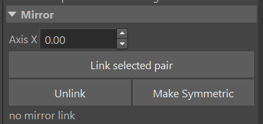
Link a left / right pair so edits propagate symmetrically. Set the Axis X (the mirror line), Link selected pair, and thereafter moving or editing one side updates its partner. Make Symmetric matches one side to the other, and Unlink breaks the relationship.
Color palette

The palette along the bottom of the editor holds quick colors — secondary / primary for Left / Center / Right — so you can color a selection with one click and keep a consistent left/right convention across the board.
Saving and sharing pickers
A picker lives on a PICKER_DATAS node in the scene (stored as JSON), so it
travels with the file. Use Save to export the current picker to a .pkr
file and Load to bring one in — the way to reuse a picker across scenes or
share it with a team.
Note
mGear 5.x note: picker data is stored as clean JSON. A picker that
lived only on a scene node in a much older version (with no .pkr
file) is not auto-migrated and should be re-exported once; .pkr files
and file-backed pickers are unaffected.